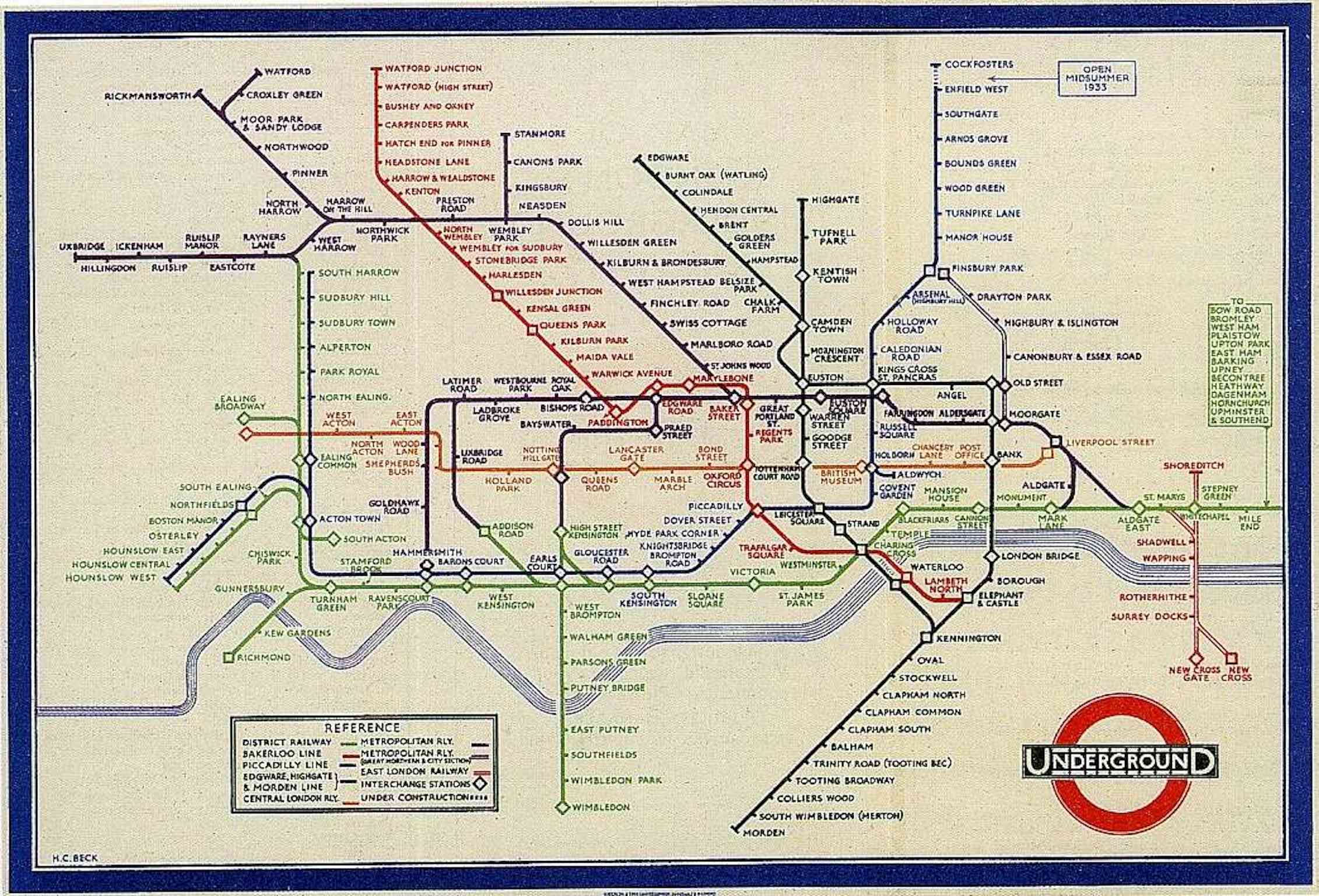
But Harry wasn’t the only player. In the 1960s, London Transport decided to “modernize” Beck’s map with fancy calligraphy and curved lines. They hired a graphic designer named Paul Garbutt—and the result was a disaster. The public wrote angry letters complaining that the new map was “confusing” and “ugly.” Don’t you love when people revolt over a subway map?
Beck, now retired, fought tooth and nail to save his creation. He even drew his own revised version in 1966, but London Transport ignored him. Rude, right? Eventually they realized their mistake and brought back the clean, angular style. Garbutt’s version? Let’s say it’s now a collector’s item for nerds who love bad design.
What makes it so durable (and a little funny)
The London Underground map survives because it’s not a map. It’s a diagram. Beck borrowed the concept from those complicated circuit diagrams he used to draw—but he applied it to trains. That’s why, to this day, the map shows Central London taking up more space than the suburbs (even though in reality it’s tiny). Because nobody cares that it takes 45 minutes to walk from Covent Garden to Leicester Square; they just need to know which train to catch.
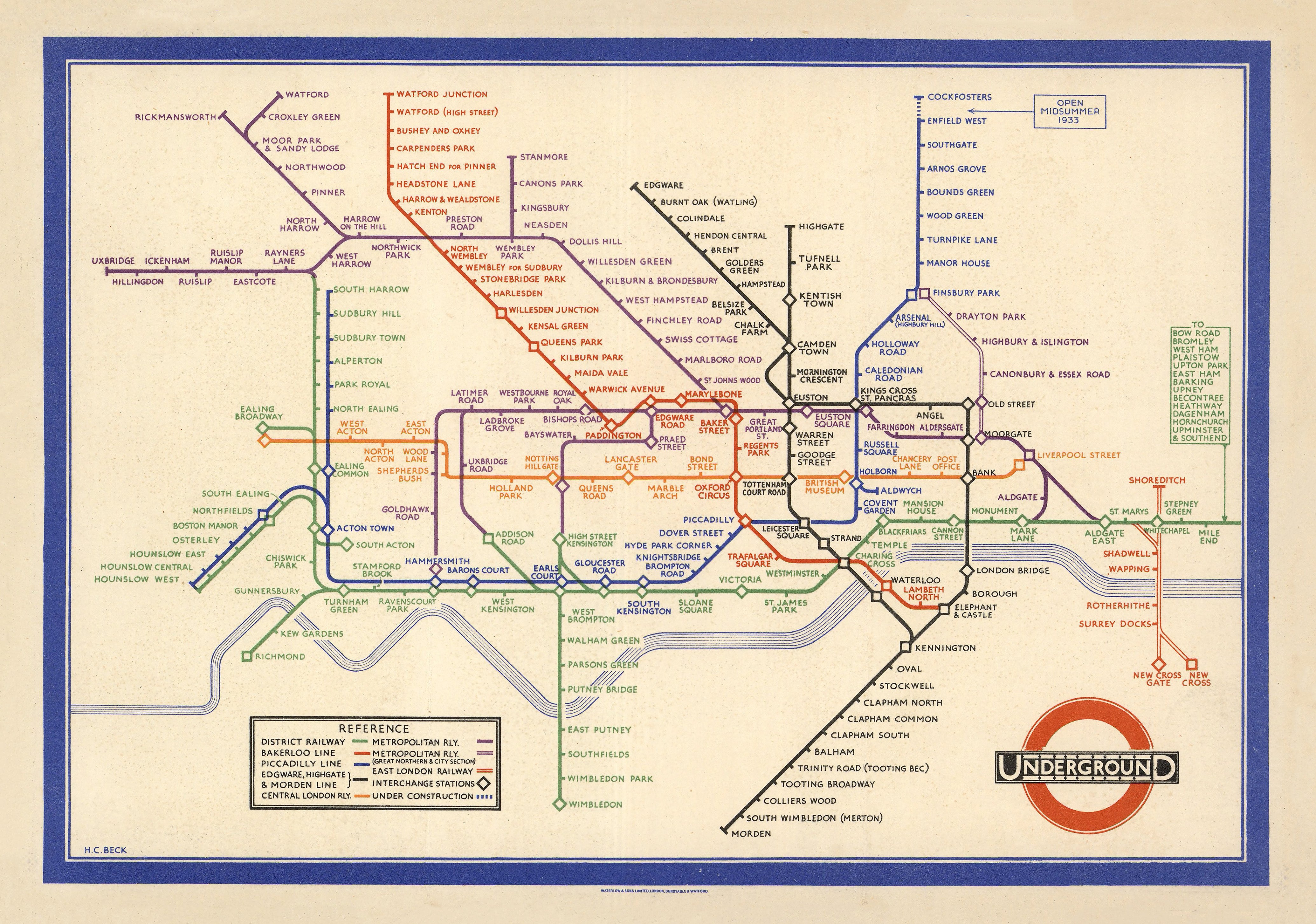 London Underground, designed by Henry Charles (1933) | Mapworld
And yet—here’s the funny part—the map is technically wrong. If you tried to walk the route shown on the map, you’d get lost in a tangle of streets. The Thames doesn’t curve that neatly. And the distance between stations on the same line? Completely a lie. But who cares? It gets you to your destination without a mental breakdown.