
Why does this matter? Because W H Smith is the unsung hero of every British commute. You buy your Penguin paperback there, your emergency pack of chewing gum, and that weirdly expensive bottle of water. The brand is so woven into daily life that a name change feels like a betrayal—like if the Queen suddenly started wearing Crocs.
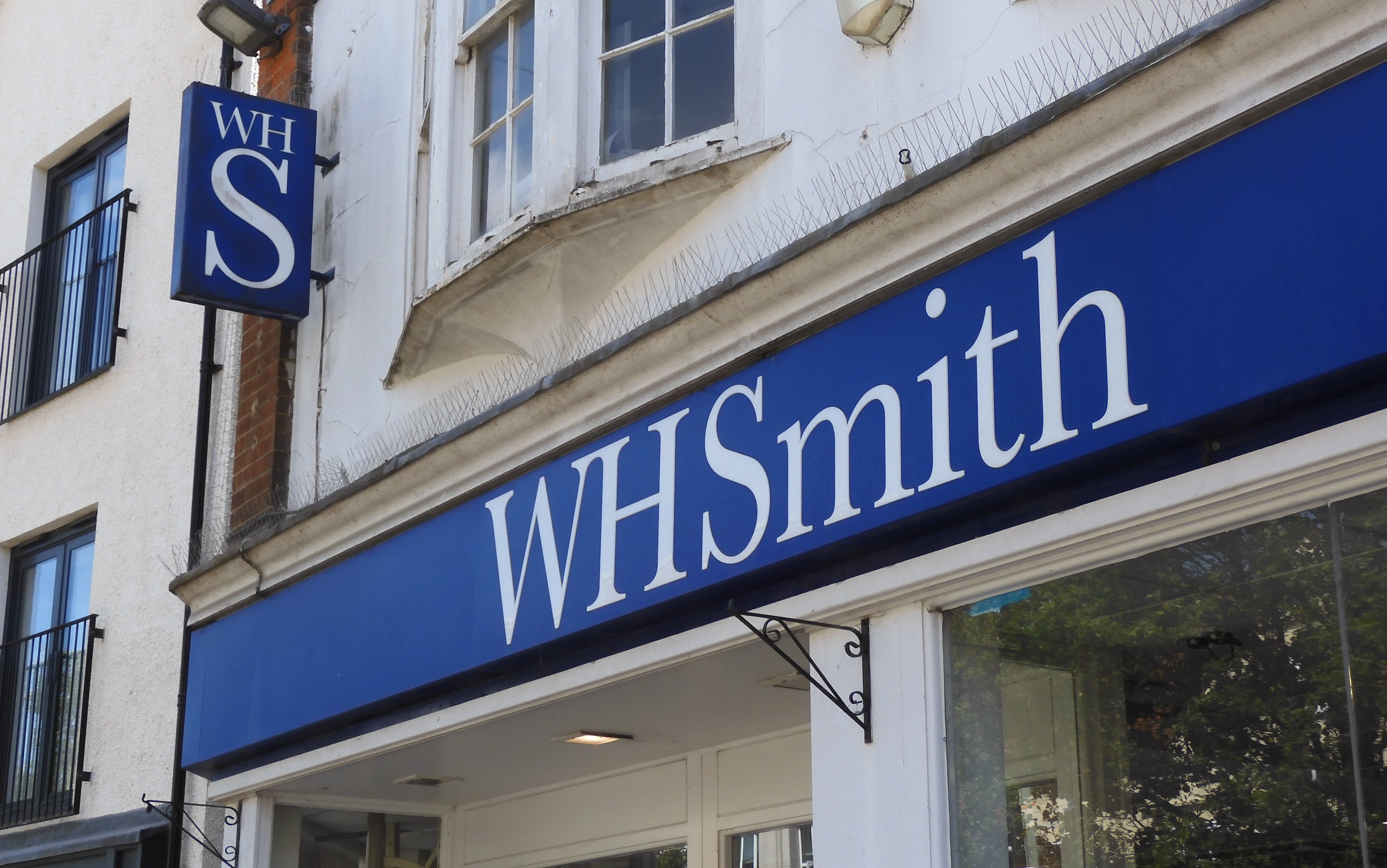
Fun fact: W H Smith was founded in 1792 by Henry Walton Smith and his wife, Anna. Their son, William Henry Smith, turned it into a newsagent empire. The name hasn’t budged since the Victorian era. So when a social media user snapped a photo of a stripped-back “WHSmith” sign (no periods between the letters), the internet lost its collective mind.
What Actually Happened
Here’s the truth from corporate: the brand isn’t changing its name nationwide. Instead, the company is freshening up its logo for specific “travel essential” stores. Think of it like a capsule wardrobe—same personality, just a sharper blazer. The old-school “W H Smith” with its serif font still rules the high street.
But this isn’t just about letters. It’s about how we perceive a brand that’s seen two world wars, the rise of Amazon, and the death of the printed Yellow Pages. If W H Smith wants to survive, it has to look like it belongs in a sleek airport terminal, not a dusty Victorian corner shop. Smart move, honestly.
Practical tip: next time you’re in a train station, check the signage. If you see “WHSmith” without the dots, you’re in a test store. Snap a selfie—you’re witnessing brand evolution in real time. It’s like spotting a celebrity without makeup.
 Smith & Jones: A Brief History of W. H. Smith’s High Street Shops

